
Five simple things that will immediately improve your diagrams
Practical tips for good-looking diagrams

When it comes to drawing diagrams, figures, infographics, etc, we could sit here and tell you things like "less is more" and "have clear intent" and "balance is the key" but... while based in truth, this simplistic type of advice is almost broad enough to be useless. In today's article we'll examine 5 practical tips that will immediately improve your diagrams.
Introduction
There's no mystery here — just like writing, drawing good diagrams is a skill that takes practice to get good at. Artistic ability certainly helps, but we are here to tell you the good news that it's not an absolute requirement. If you've ever looked in dismay at your diagrams or figures, wondering why they don't look as good as you'd hoped, this is the article for you.
That's enough intro: let's get to it.
5 practical tips for good-looking diagrams
1. Use shades of grey instead of outlines
Instead of outlining shapes like boxes and circles, try removing the outlines completely and instead filling each shape with a shade of grey. Here's an example:

Sample diagram showing a group of three states and transitions (arrows).

The same diagram with tip #1 applied.
A small but meaningful difference in quality is evident. Both versions of this diagram communicate the same information, but the right-hand diagram looks better. The logical grouping is no less clear, and there's more direct visual distinction between state nodes and the transitions. And, it simply looks as though a bit more care has been put into its appearance — which is true, even though it took all of 10 seconds.
Limit yourself to 2-3 shades of grey for each diagram, and use the different shades to represent any hierarchy that may exist. For example, big groups of shapes that belong to the same or similar category can be grouped by a big, light gray shape. Objects belonging to the category can be placed inside and use a darker fill.
In general, the darker the shade of grey you use, the more emphasis that element will have on a light background, or printed on paper.
You do want to be careful not to choose a shade of grey that is too close to the color of any text that may be on the shape. Accessibility guidelines suggest that most small or mid-sized text should have a contrast ratio of at least 4.5:1. A handy tool for checking the contrast is https://webaim.org/resources/contrastchecker/.
You also may want to choose a family of greys that belong to a specific hue. For example, if your brand's primary color is a blue, choose cool-colored greys.
Here are three starter greyscale palettes for you to use. Each is designed to maintain a contrast ratio of at least
4.5:1 assuming a text (or foreground) color of pure black (RGB #000000).
2. Use a maximum of 2-3 colors
As a rule of thumb, restricting yourself to use only 2-3 colors for any one diagram will lead to more legible content. And, the brighter or more vibrant the color, the less you should use of it. Edward Tufte, well-known for his visual design principles, has said that poor use of color can be worse than no color at all: it can make the wrong information stand out and make meaningful information harder to see. So go easy on the colors.
How does this work with the shades of grey advice in tip #1? If you're using both — greyscale and colors — limit your diagram to use no more than 2 shades of grey plus 2 colors, not counting black and white. If you feel like you need more, it may be worth reexamining what you're trying to illustrate. Your diagram may be trying to communicate too much all at once, and it may be wise to break it apart into more than one diagram, each referring to the other using some simple visual abstraction.
Finally, especially if you're not coming from an artistic background, try using colors either for semantic differences (e.g. all transitions of a particular type are green, the rest are black) or to highlight important elements, and not both.
What colors to use? Any palette generator will give you a handful of coordinated colors. You can start with these sample palettes — remember, pick just 2 or 3 colors per diagram, and use the brightest colors sparingly, if at all.
3. Use more whitespace than you think
In technical domains like engineering and science, some authors naturally gravitate towards information-dense visuals. Information density is appropriate in some cases, such as when the readers tend to be as fully versed in the material as the authors. However, our recommendation is to back away from dense diagrams at first, and instead use more whitespace than your first inclination tells you.
Let's make this tip more concrete by looking at three specific approaches.
Use empty space to separate logical groups. Resist the urge to separate logical groups by putting them inside of a large bounding shape. Instead, simply place the components of each logical group fairly close to one another, and then increase the empty space (distance) between the different logical groups themselves.
Add whitespace at the endpoints of connectors. Simply by adding a bit of a gap to your connectors, you visually distinguish the connections from the shapes themselves, which is often an important distinction (e.g. states versus transitions).
Move labels and titles farther away from their content. While it's possible to go too far with this one, start by increasing the distance between a title or label and the content it applies to. Combined with more use of whitespace in general, this can add much-needed room to breathe in your diagram.
Here's a simplistic example diagram to illustrate these tips. It's simple, clear, and feels easy to understand at a glance:

Whitespace is a big topic in graphic design. If you're interested in learning more, a good starter resource is https://www.interaction-design.org/literature/article/the-power-of-white-space.
By the way...
In scenarios where information-dense visuals may be appropriate, perhaps because you expect your readers to be well-versed enough to tolerate it, it's still worth taking a pause. Ask yourself: if they're so familiar with the material to not be bothered or confused by the information density, can you actually just omit some of the material altogether?
4. Use consistent sizes and spacing
This tip may sound obvious, but you can take this one surprisingly far. Use a consistent set of sizes for shapes. And, use gaps that are the same size as the shapes themselves (if appropriate). The visual repetition of positive and negative space is naturally appealing, and will lend an ordered feel to your diagram.

Sample diagram showing a linked list data structure.

The same diagram with red boxes showing how the whitespace was measured.
The same goes for text in the diagram. Choose a title size and a label size, and maybe one more in between. Stick to using just those 3 sizes unless you can't avoid it.
Applying this tip together with #3 (whitespace) and #1 (greyscale) can lead to surprisingly stunning visual results, without much effort.
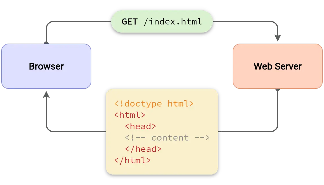
5. Label your arrows
Don't depend on your readers to guess your meaning: label your arrows and connectors. While there are some scenarios where labels are truly unnecessary and even an impediment, generally you should default to labeling your arrows and only remove them if it's abundantly clear what the arrows mean from context.
Bonus tip: make your text bigger
This one's short and sweet. Just make your text 20% bigger than you think. Remember to leave a good amount of whitespace around the text.
Before and after
We took about 2 minutes to spruce up a simple technical diagram showing client-server synchronization. Which looks better, left or right? See if you can figure out which of the tips we applied.


Further reading
We hope you find these tips simple and effective for making your diagrams look better with little effort. If you're interested in more, here are a few other resources that we've found helpful:
-
Effective Technical Diagrams: https://serialized.net/2020/02/effective_technical_diagrams
-
Rhythm in graphic design: exploring graphic design rhythm: https://fabrikbrands.com/branding-matters/graphic-design/rhythm-in-graphic-design-rhythm-principle-of-design/
-
The power of whitespace in design: https://www.interaction-design.org/literature/article/the-power-of-white-space
-
Everything you need to know about spacing & layout grids: https://www.uiprep.com/blog/everything-you-need-to-know-about-spacing-layout-grids
-
Why you should care more about your diagrams: https://vexlio.com/blog/why-you-should-care-more-about-your-diagrams
If you want to test these tips out, try making a quick diagram in Vexlio now (no signup needed): Launch app now

Launches in your browser, no sign in required.
Latest Articles from Vexlio
Making diagrams with syntax-highlighted code snippets
See how you can easily add syntax-highlighted code blocks to your diagrams.

Why you should care more about your diagrams
Learn why the diagrams you create matter more than you think, and deserve your attention.